Fine Art Prints & Posters
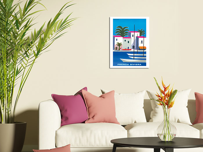
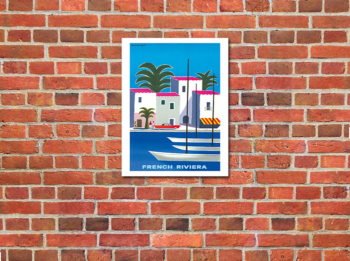
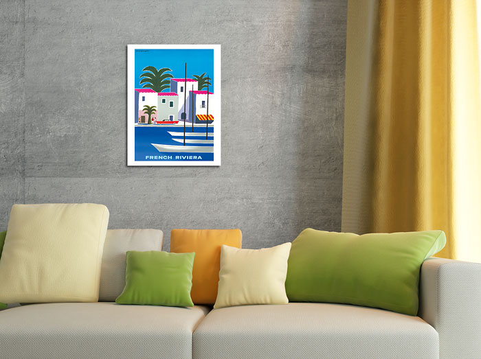
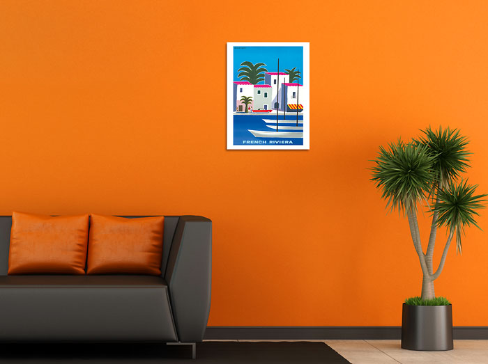
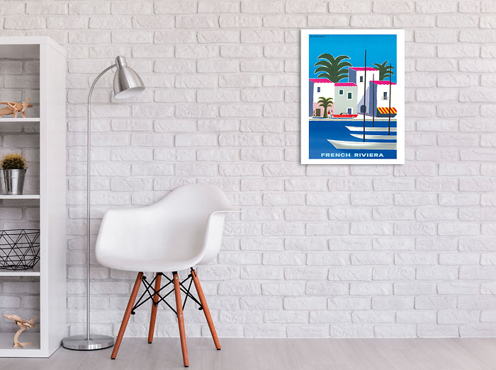
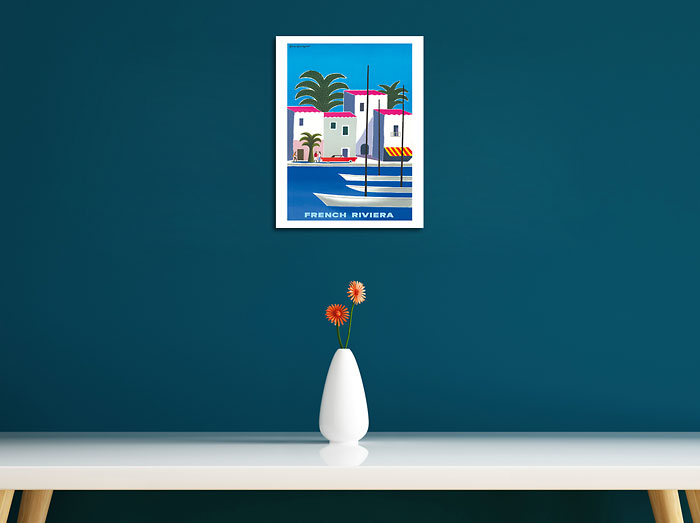
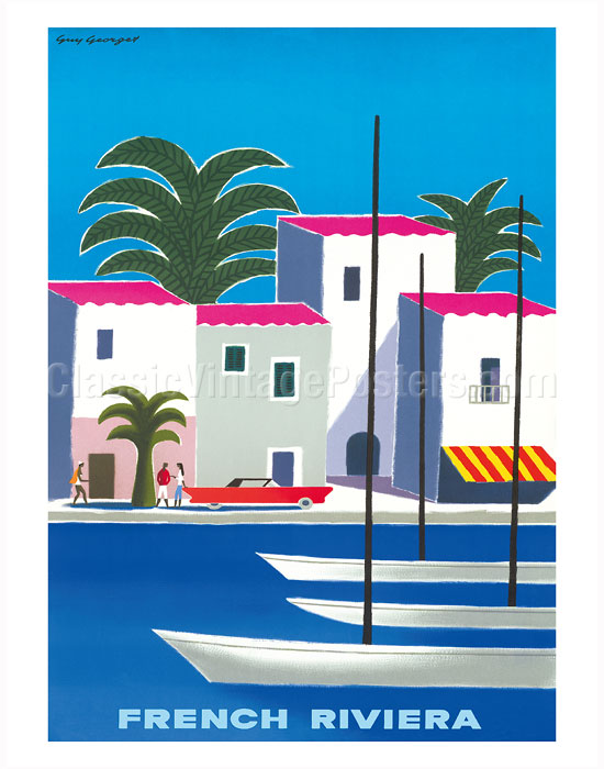
French Riviera - Côte d'Azur South Coast by the Mediterranean Sea
Guy Georget
DISPLAYING: 11" x 14" Fine Art Print
GUY GEORGET (1911-1992)
Georget's first commercial posters appear in the late 1940s. Hired by the tourist boards, the artist produced posters tempting people to visit Spain in which you see the influence of Picasso and Georges Braque.
Looking at the artist' work s from this period, one is struck by his sense of composition and perspective, and his rather classical choice of subjects. His "España" from c.1950 poster looks a lot like a still life, with rather emblematic objects of that specific genre – fruits, amphora. However, after a closer look, some signs of his later style can be found in the geometric design of the fan, the yellow of the lemon. During this period, he also worked for a french aviation company, another prestigious post for graphic artists of the time.
During the 1940s, the 1950s and the 1960s, his style evolved from traditional to fun and light hearted. If you look at his work chronologically, you will see how his style became more graphic, his lines bolder, his colors brighter. His "Mexico" poster for a french aviation company from 1963 flirts with cubism. The white outline around the character and the palm leaf makes it appear almost as a collage. The result is a bright, attractive image, evoking Mexico's sunny weather, folklore and exoticism.
A talented graphic artist to must be "au courant" - on the cutting edge of new trends, of the evolution of art and perception: by adapting his style to his time, Georget managed to keep his clients' image modern and attractive, and proved his talent as a poster artist.

